Thursday 6 June 2013

Friday is party time

Hi you all, another week is over and it's time for Paint Party Friday again, hosted as always by Eva and Kristin. I have made a spread in my giant journal again, which I am also linking to Piarom's 'Mix it monthly' challenge 'Vintage meets Picasso'.
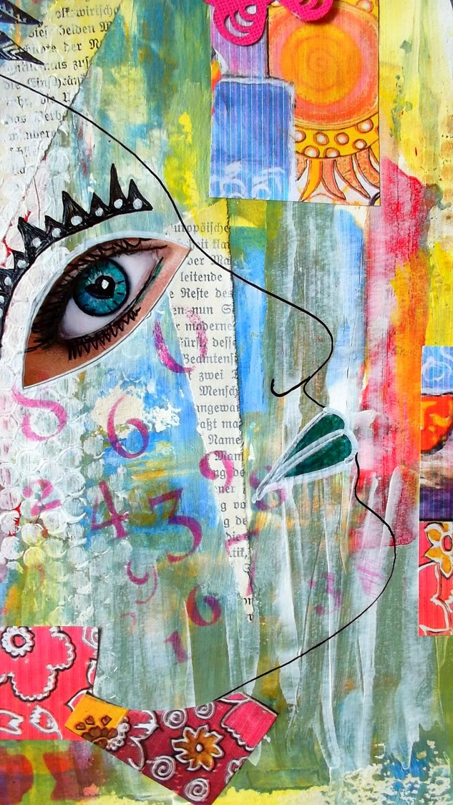
I had a lot of fun painting, collaging, stamping, stenciling and doodling here. I did the background with yellow and purple, and added in some blue here and there to fill the gaps. The ladies who are floating around have been stenciled using color-box ink in peonie, and I have partly outlined them with a gel-pen, leaving other parts to let them melt into the background. I put 'my' head into the left corner, and beautified it with eyes and a mouth from an advert. The images were black and white, so I was able to colour them as I wanted. The legs, shoes and painty hands are all from different adverts, mixed with parts of Conny's 'Picasso'. The butterflies were cut with an X-cut punch, and the quote is from Harlan Edison. I know a lot of people don't like him, but I do, although he is rather impossible sometimes....I had great fun doodling the patterns and  flowers, and adding in lines and squares at different places. As this also has a lot of numbers on it (CWS stencil) I am also linking to Dawn's Journal Journeys where the theme this month is numbers.


I put the eyes on the bosom because I know a lot of men like to look women in the eyes....


Have a great day, take care, and thanks a lot for coming by!

Tuesday 4 June 2013

The Jewel in my Crown

Hi you all!
Well, actually, the only crowns I have are dental ones, without jewels, but never mind!
The challenge over at  Out of a Hat this week is 'jewel in the crown', and here is my card:


The background has been stamped using various stamps from LaBlanche, and then the lion and window were stamped twice and fussy cut to make them pop a bit. 
And someone is behind the window, watching....


Have a good day you all, take care, and thanks for coming by!

For the Men - new challenge at TIOT

Hi you all! Today is the begin of a new challenge over at TIOT - 'For the men'.
I have made yet another easel card. The image is from Gecko Galz, and reminds me of Downton Abbey.
I fussy cut the image and mounted onto some dark brown paper with a very elegant design, and mounted that onto some gold embossed paper - nothing but the best! I added a few punched swirls made from a scrap of the gold paper. The sentiment is a quote from Winston Churchill. The little card on the stopper can be opened and closed with the ribbon.
The image and background were printed out for me by Diane, and came together with the things I showed yesterday. Thanks again!


I am also linking to Sugar Creek Hollow, 'make a masculine card for Father's Day'
and to Simon Says Stamp and Show - 'S'  - simple, satisfied, shiny, satin, sleek man.

Have a nice day, take care, and thanks for coming by!

Sunday 2 June 2013

Happy mail and another Masculine card

Hi you all, hope you all had a good weekend!
Last week I got a lovely card and letter from Diane in Michigan. I had told her that my printer was making problems, and printing everything with a stripe pattern. She was so kind and sent me some print outs that I needed for challenges, and the lovely papers you can see below, all the way from Michigan. Now, that is what I call special delivery! I can't show the images she printed, as they have already been used in various projects, which I will show soon. She sent this beautiful card with it. It is even nicer in real life, if that is possible, and I have it here on my desk now.


And these are the gorgeous papers - wow!


Thanks a lot. Diane, you are a star!

I made this little joy fold card using one of the papers:


At Sugar Creek Hollow the challenge is to make a masculine card for Father's Day in shabby  or vintage design. I have made a vintage one. The background shows a vintage photo of an office, overlaid with some numbers printed onto acetate, and a phone, which I printed out, covered with glossy accents, and fussy cut. The old Jalopy is from TH, and the dashing young men are from Gecko Galz 'Smart Dressed Man' collage sheet.


The stopper of the Easel card has a hidden pocket under it for a sentiment or a little present.


Saturday 1 June 2013

Art Journal Journey - Home


 Hi  you all. The theme over at Art Journal Journey this month is 'Home'. I was asked to be the guest designer this month, so thanks for asking! And now to some explanations to my journal page.
I have lived in several different countries, and have been in Germany for many years, but my home was, is and always will be London.
I grew up in post war London. The buildings were all blackened from bombs, smoke and fire. There were gaps everywhere where houses had been destroyed, sometimes whole streets. These bomb sites were our playgrounds. I was born near the Tower of London and the Docks, and lived in the heart of Jack-the-Ripper land - and loved it. It was one big adventure from start to finish. Places to hide, ruins of bombed-out houses where we played 'house', little alleyways and cobbled streets, loud and lively markets in Cable Street, Petticoat Lane and Spitalfields, dark Churches - especially Christchurch Spitalfields which we all convinced was haunted, and a beach at the Tower of London, which has now been closed for many years. Much of the area underwent demolition, but a lot of the old streets and houses are still there, much cleaner and better decorated than I remember them. Docklands has become a paradise for the rich who live in the lofts made in the old warehouses. But the Tower is still there, and Tower Bridge, which is now white and clean as new again. And when I visit London, I always take a day to walk around my old haunts.  It's a good feeling to be there, even though so much has changed.

The predominance of grey in my picture symbolizes the dirt, dust and smoke of London after the war, and the broken lines the destruction. But in between there is blue and yellow, for the blue skies and sunshine, and for the positive feelings I associate with my home town.
The row of pictures at the bottom show Fournier Street and Christchurch, Tower Bridge, the Tower, Warehouses, Harads Place and Fournier Street again.
And my head is full of London, as you can see.


This was exactly the right theme for me, thanks! Have a good day, take care, and thanks for looking.

'Maybe it's because I'm a Londoner, that I love London town'

Friday 31 May 2013

Manon's Paper Saturdays

Hi you all! It's weekend, so hopefully time for you to relax.
For Manon's Paper Saturdays I have made a masculine card. It is a variation of the bendy-fold card. You can find a tutorial to make this card here at Splitcoast Stampers. I altered the size and form a bit to fit my masculine card.
I cut the form from cardstock, and glued the Graphics 45 'perfect gentleman paper to it to give it more stability. The reverse has been lined with some script patterned paper. The gentleman hanging on to his hat is from GeckoGalz' 'sharp dressed men' collage sheet.
The card can be folded flat and put into a 6x6" envelope to send.


This is fun and easy to make, and makes a card that is a bit different.

Have a great weekend you all, take care, and thanks a lot for coming by!

Thursday 30 May 2013

Paint Party Friday and Piarom's Mix-it Challenge

Hi everybody!
Another week is done and dusted - wish I could say the same for my place! - and it's time for Paint Party Friday again, hosted, as always by Eva and Kristin. And Piarom has started a new challenge 'Mix it monthly', where the theme this month is  ' Yellow vintage girl goes Picasso'. She gave us as inspiration a photo of a fifties girl in a butterfly hat, and a beautiful 'Picasso' which she painted herself. I have incorporated the butterfly hat of the vintage lady, and some parts of her painting, cut up, into my journal pages. I have painted them in my giant journal, the spread is 60x42cms. I used a spread I started over a year ago, and didn't like, and now it is finished at last! It was rather hard for me adding all that colour, I didn't like it at first, but afterwards I just loved it - still do! The background has been made with book-page snippets, stencils, and various colours used over wet gesso, which tones them down a bit. The yellow and pink and bright blue went on top and it really made it pop. I have used various magazine cut outs for the face, body, eyes and mouth, which have then been doodled and 'improved' by cutting them apart etc. I am a compulsive magazine page ripper, and have to tear out pages I like. Of course, I do not do this in the waiting room at the doctor's. Well, not if anyone is looking! 'My' faces have also been jazzed up a bit with colours and patterns, I think I will try to get my eyebrows looking like they are here, that would be fun. The rather controversial quote is from Harlan  Ellison.


I'm sure I can't remember painting those eyes just there!


This was great fun to make, in spite of the colours, and I really was surprised what a difference they make, and how good it looks with layers of colours one over the other. Thanks Conny, for the inspiration to this challenge.

Have fun party and a great weekend,  take care, and thanks for coming by!